Books Are Experiences
I’m really excited to be talking to you about the experience design of books and to share a little of the design adventure I’ve just gone through.
How are you feeling about AI these days? Curious? Anxious? Excited? If you’re anything like me, it’s all this and a queasy fear that we are being dragged even farther from the embodied humanness we seek in the artifacts of culture. Don’t get me wrong, I’m fascinated and a little obsessed with what AI can do, and have watched student artists engage in some brilliant rapid prototyping with it. But I do feel some of the same unease I felt when the Kindle and the Nook and other e-book readers started grabbing market share. That felt a touch apocalyptic too. Back then we thought books made no sense in a digital time—they were heavy and hard to ship and hard to carry around. It made sense that books should just be digital—isn’t it all just information in the end?
But the much-predicted end of physical book publishing never materialized.
It turned out that there was much more to reading a book than just the words. In 2021, e-books represented less than 10% of the market while physical book sales were, in fact, 41% higher than in 2012. Books stuck around because they are these brilliant, single-function machines for storytelling.
In the last decade, books like S, by filmmaker JJ Abrams and writer Doug Dorst, a filmic package made to look like an old, written-in library item, or Things I Have Learned in my Life So Far, by designer Stefan Sagemeister, which is made of up little pamphlets each exploring the physicality of words, capitalized on the embodied experience of the book in a way that a Kindle never could.
A book has weight in the hand. It has presence in your bag or by your bed or on your bookshelf. Even if you haven’t written in it or dogeared it, you can still register its history. Where did you get it? Who gave it to you? Did you lose it and find it again? Did you read it on a grey, rainy afternoon, sitting by the window?
I’m not trying to raise the anti-tech flag here. Rather, I am interested in how moments like ours, when change challenges traditional design practices, reveal the experience design learnings embedded in traditional practices. What does the staying power of the book have to teach us about designing for focus?
When I sat down with Erica Holeman to talk about designing a book about experience design, the task was daunting. The book was to lay down 10 basic principles for the practices of experience design, but it was to be an experience itself. How to do that? We played with all the traditional tools of graphic design—the white space, the typography, the hierarchies—as well as the way a book is a conversation with the reader. We addressed the reader, asked the reader to write in the book, to tear out pages, to hold their breath.
Many things made it into the book, but even more ended up on the cutting room floor. In the end, we wanted to focus our design on creating a coherent world within the book. This meant the book would be a little less wild than some of our early passes, but that it would be more immersive. When you step into a book—even a non-fiction book—you step into a world, built with many of the elements of worldbuilding. It has a clear aesthetic, a value system, a population, a history, an ongoing narrative, and it even has a role for the reader.
Along the way we produced quite a few book covers. In the next email, when I announce presales, I’ll share the actual book cover. But I thought you might enjoy some of these rejected covers until then.
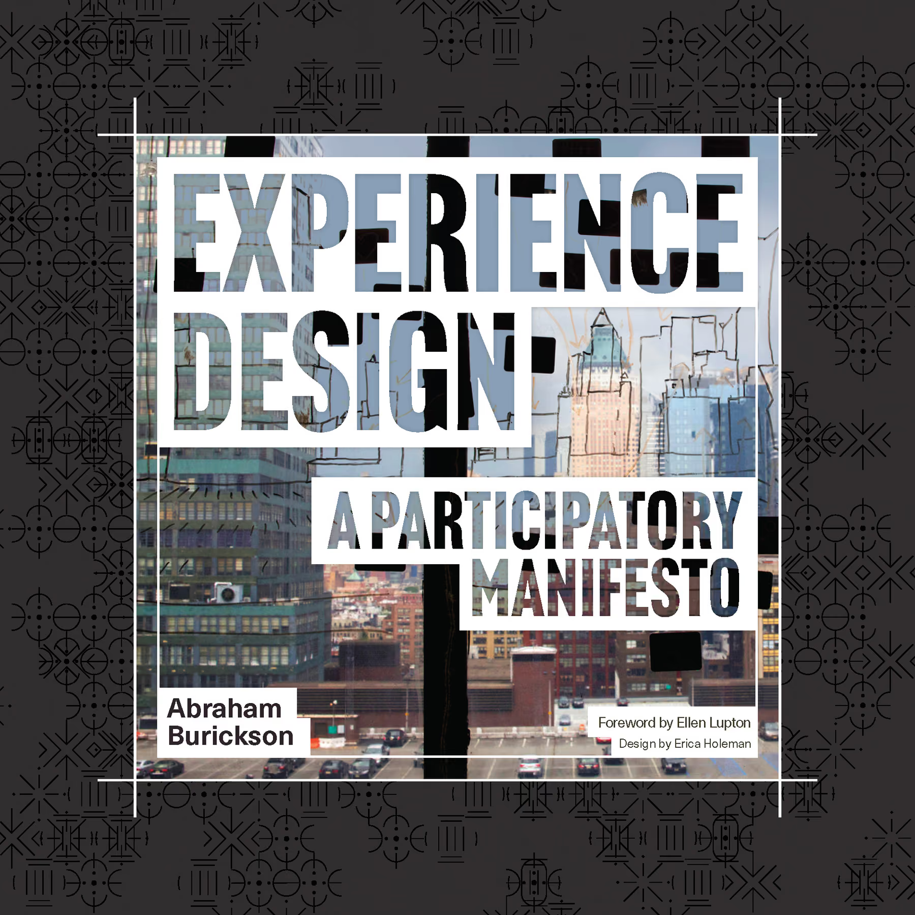
I really liked this cover. It used an image from the 2012 performance The Map is Not the Territory. This was made in the Mapping Office (Samsara Cartographic Consultants). One of our performers used chance operations to overlay a map of the city on the image of the city out the window. It was a great exploration of layering, evoking the way an experience design can take place as an overlay on the ordinary world. The frame around the image uses the graphic language we developed in the book for the idea of frames of attention.
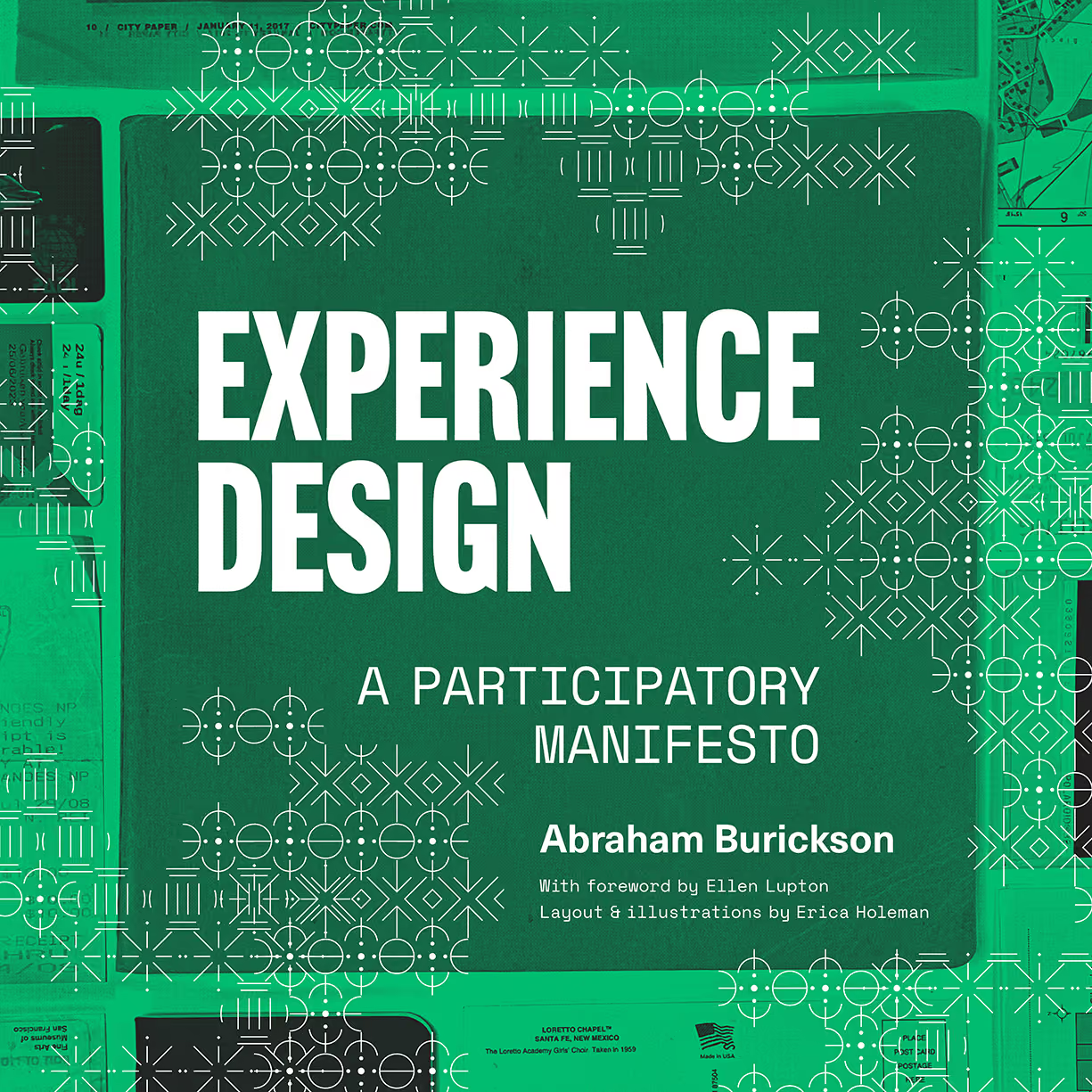
This cover evokes travel and the way that the experience of travel is embodied in the material culture that surrounds it. Why do we love our maps, our passports, all the unusual papers that we gather when traveling? The single color is the spot color of the interior design work. You can also see the filigree assembled from the symbols we created for worldbuilding concepts much more prominently here.
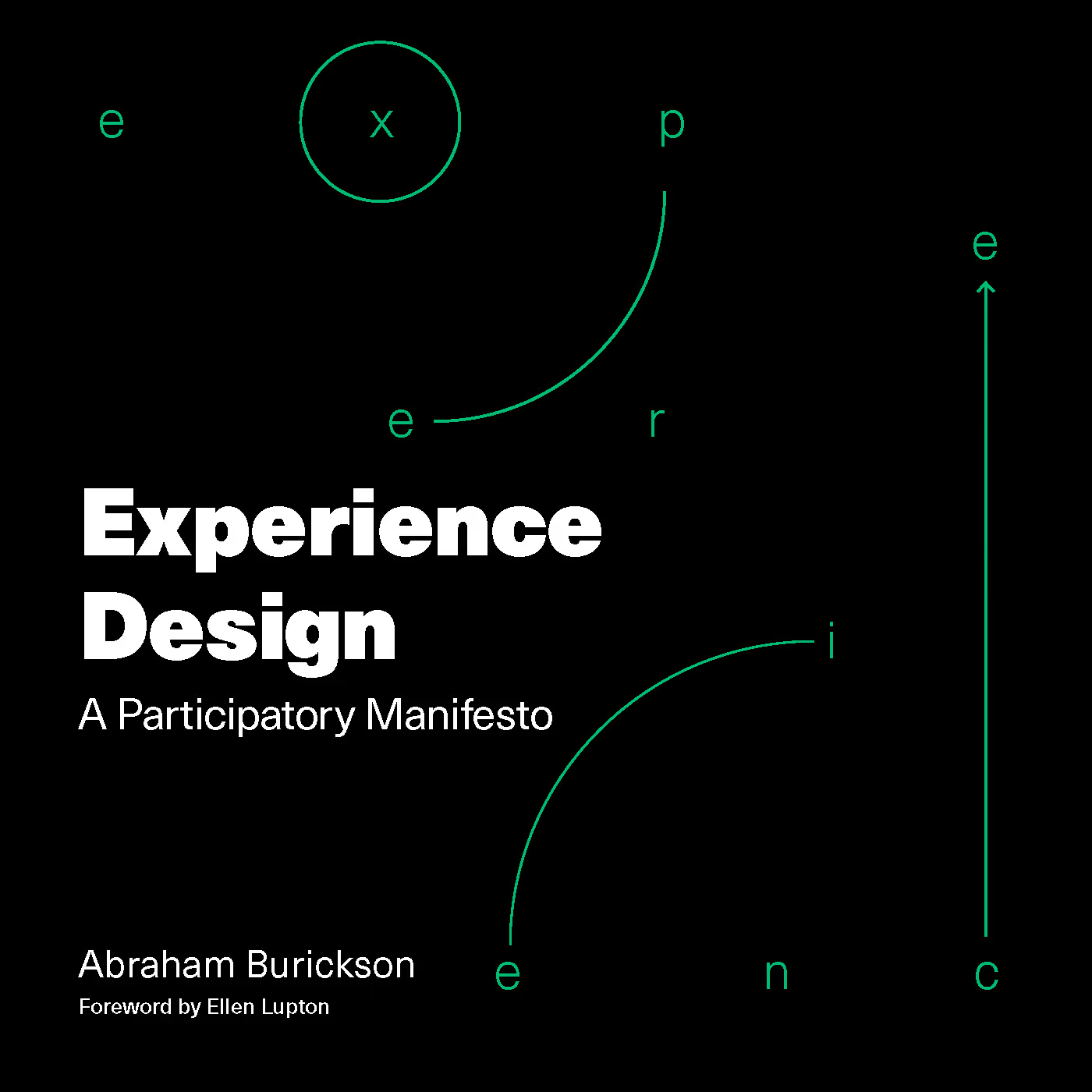
This much simpler, early design evoked the diagrammatic nature of the design approach of the book. It established a line-art language that defines much of the book’s diagramming and illustration, uses the spot color, and clearly explains itself. Ultimately, we wanted to go a little wilder.
Erica must have produced upwards of thirty cover designs. We presented three to the publisher and they chose their favorite. It’s not the ordinary process with a book—usually the author sends a text to the publisher, and the publisher gives the text to a designer to lay out. Then, when that’s all done, another designer (like, say, na kim) iterates on the cover.
The design of this book was so integral to the content that this process was not an option. Erica and I worked far more closely than most book designers and authors generally do. As I wrote, I would draft diagrams or sketch ideas for illustrations and send them to her and she would make sense of them, revise them, or come up with other approaches. We had long brainstorming sessions about how you might express empathy graphically, how a spot color could be used to indicate experiential intensity, how to make the book graphically exciting without being overwhelming.
Family Reunion!
Ayden and I just got back from the Odyssey Works Family reunion. It was a kind of unconference for anyone who has been in any of our programs or has worked on an Odyssey. Such a brilliant group of people! The weekend was only lightly designed – an experiment in non-hierarchical community-building.
We cooked together and ate together and swam together. Anyone who wanted to could lead a skillshare or a project feedback session. We heard about a vast ARG utilizing really interesting tech, a non-faith-based religious community wherein atheists and agnostics could build values-based practice within a collective structure, and ongoing research into an evidence-based framework for how we might design for savoring.
It was a wonderful experiment. There’s more to learn, but the weekend made it clear that for a community to come alive, members must feel not just invited, but excited to take ownership.
Fortunately, there are some great books out there to help with such efforts. I’ve been rereading both The Art of Gathering, by Priya Parker, and The Art of Community, by Charles Vogl.
What’s your favorite The Art of… book?
