The Diagram of a Book

Experience design is an emergent field – there are so many of us out there innovating the practices of the field and figuring out new applications for the tools we are inventing. In the excitement of this novelty we sometimes ignore the brilliant experiential qualities of more traditional designs. I’m speaking about religious practices, educational systems, saunas, hospitality, symphony halls, surprise parties, record players, campfires, and, of course, books.
One of the most important things about experience design is the preparation of the audience for the experience to come. We take off our shoes at the entry to the house, sit in our seats and wait for the lights to dim at the theater, bow before walking into the meditation hall. The preparation for what most of us think of as a book (the codex) is the cover and what is called the frontmatter. That’s the title pages and the Library of Congress page and, of course, the Table of Contents (TOC). These are necessary navigational tools in collections of stories or essays, but why do we find them in novels? Or books of non-fiction that you would only read front to back?
The TOC is a kind of diagram (really a kind of map), there to prepare the reader for the journey ahead. Do you linger there? Do you find yourself wanting to skip ahead to that more exciting chapter title but knowing you have to work up to it? There are lots of different ways to design a TOC, and when Erica Holeman and I were working on my new book we tried dozens of iterations.
I wanted the TOC to express the interconnectedness of the ten principles laid out in the book. Worldbuilding is very much about framing; Designing experiences instead of things must involve an empathetic understanding of your audience; etc. The sketch I sent the designer Erica Holeman had a woven-cocoon quality. It was a good start, but would have run into trouble in the gutter.
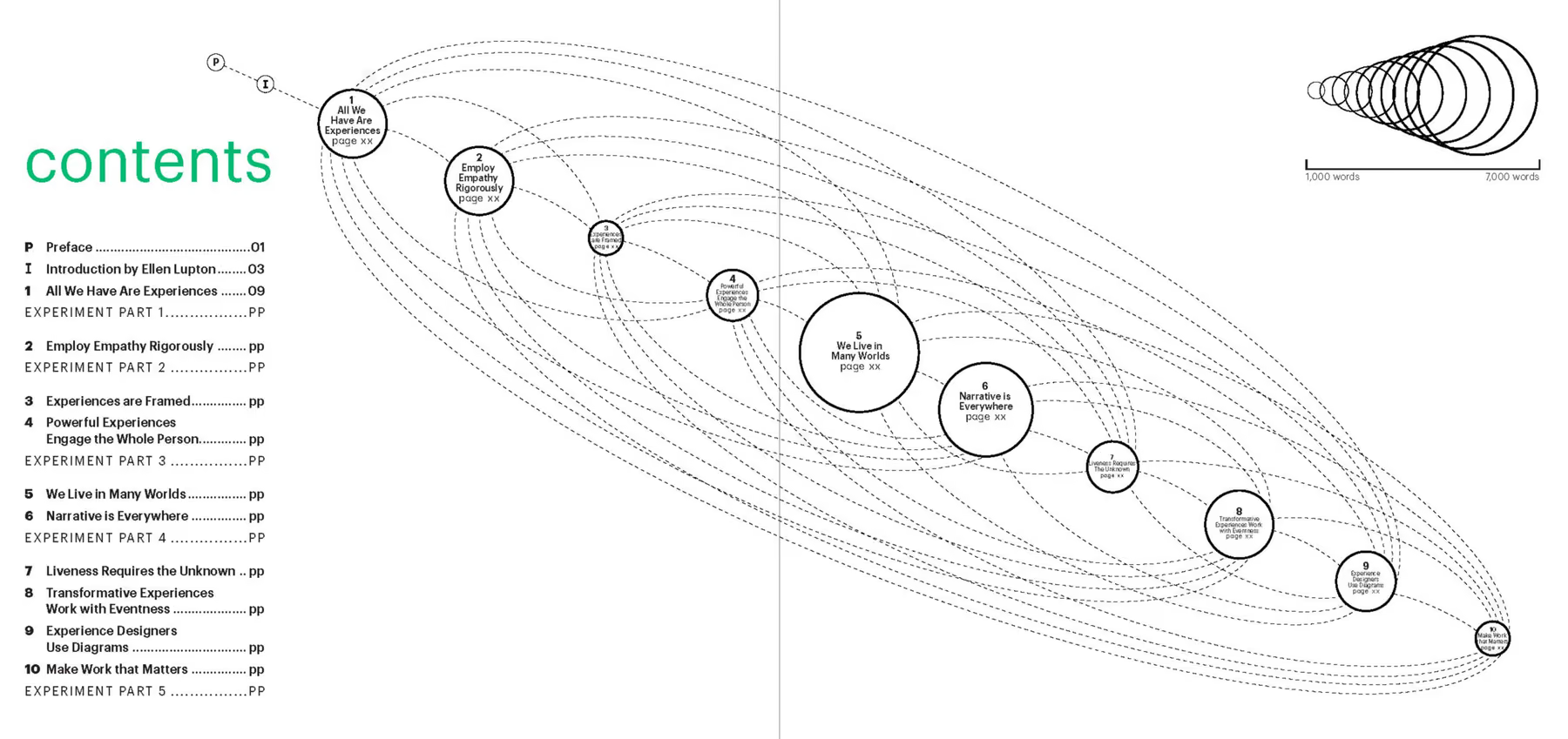
We tried a horizontal version. Same problem:
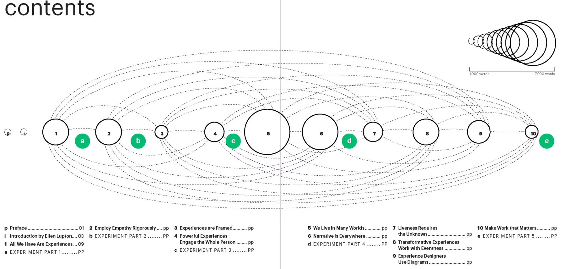
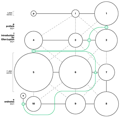
We really liked the cocoon quality, the sense that all the ideas interwove, but we wanted to see if it might work better if we invoked a spectrum of ideas working together to create a single whole. We were pretty happy with the way longer chapters were bigger (something TOCs don’t readily show without having you do a little math).
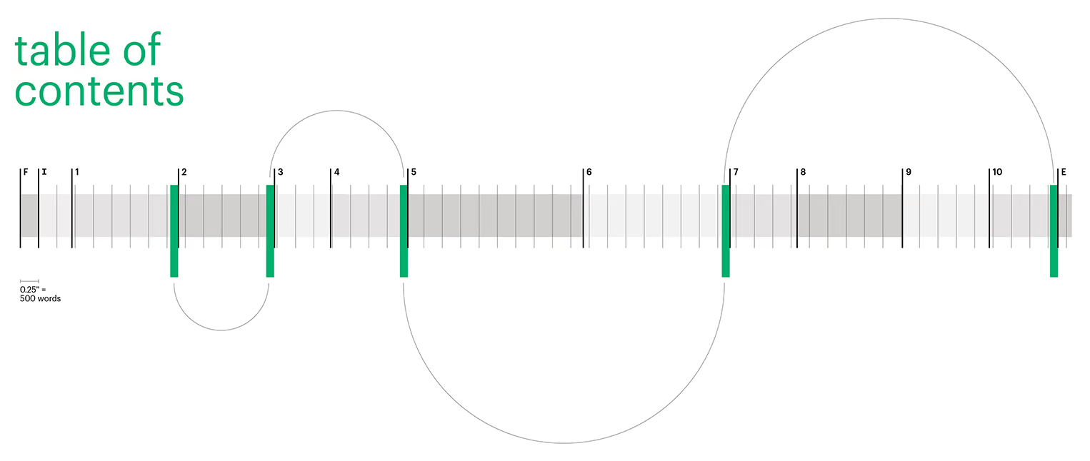
Or what if it had more of a flow chart feel?
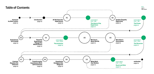
The green parts were the interactive experiments inserted throughout the book. They are one long experiment, meant to build step by step, integrating the ideas in the book as they did. We also wanted to use the TOC here to introduce the use of the green spot color as a sign of something that was experientially particular. You’ll see that in the illustrations, and they begin to become legible once you know how to look for them.
Erica tried one that evoked a geared machine—perhaps a printing press—with the experiment rolling through:
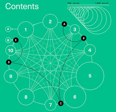
In the end, we found the web idea most compelling. It was visually comprehensible at a glance, it clearly expressed the relationships between the chapters, and it could be cut up nicely to make chapter openers that would be recognizable as extracted from the TOC (see the top of this newsletter).
Got a favorite TOC? I’d love to see it!
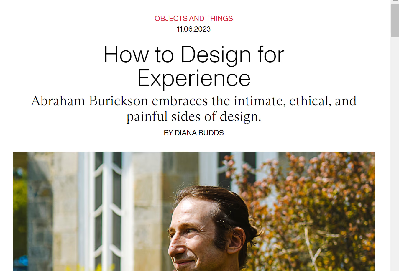
Diana Budds from UnTapped Journal reached out for their What’s to Gain from Pain issue. No-Pain-No-Gain isn’t usually my artistic M.O., but there something to be said for challenging your audience. After all, what can change if everything in life is bubble-wrapped?
Casey Rosengren is a brilliant thinker, consultant, and creator of communities. We spoke about Odyssey Works and my new book in the context of this larger article about designing products for a single user. It’s great to see the ideas contextualized as he does in this Every.to article.