Branding Is Storytelling: Anatomy of a Rebrand
Branding is Storytelling
I’ve always thought it sounded a bit crass when people talk about branding themselves. I think what we’re really asking are:What are the stories you tell about who you are to others? How are such stories told not just in words but in what you wear, what you carry around with you, how you walk? Our identities are stories we craft in order to be part of the human world – permissible fibs, as Adrienne Rich would say.
It wasn’t until I started teaching in the Graphic Design MFA program at MICA that it occurred to me that the process of branding was also the process of sculpting a narrative that made sense to oneself. What are you really about? the branding project asks. I’d always thought branding was about logos and typefaces, but these should be, in fact, the end product of an interrogation of purpose.
And then it came for us. The Rebrand. We had been in a bit of denial about it; we had two websites–one for performances and one for everything else–and you’d be forgiven for not knowing why. The actual experience design and consulting work we’d been doing was represented nowhere. We had started a foundation to fund our scholarships, though only our donors knew about it. We are heading into our 4th year of the Certificate Program and the 24th year of the organization. This year has been full of massive leaps and changes, hiring, growing, and becoming ever more clear about our mission.
Ok, so how do we articulate this mission? our designer Victor Carinha asked.
Such a simple question. Not such a simple conversation.
That was last winter…
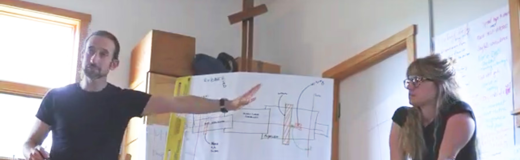
Anatomy of a Rebrand
Our mission is to inspire and empower others to create meaningful experiences that transform the way we engage with the world.
It took us a while to articulate it this way, and now it seems so obvious that that’s how it should be said. But how does such a mission look?
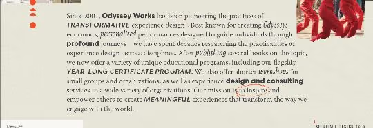
When we were publishing our book, the marketing team at our publisher had quite the headache thinking about marketing Odyssey Works. Our origins and history are complex, what we do is singular and hard to describe–it turned out this was the key. We were fortunate to work with Carinha as well as designers Megan Irwin and Erica Holeman to guide us (turns out that teaching Graphic Design means you get to know amazing designers before they’re too famous for you). They helped us articulate how our identity needed to express a sense of our long history, a community-driven ethos, and a love of the analog in a digital world. We felt that our approach to experience design owed more to tradition than to new technologies, to books more than to screens.
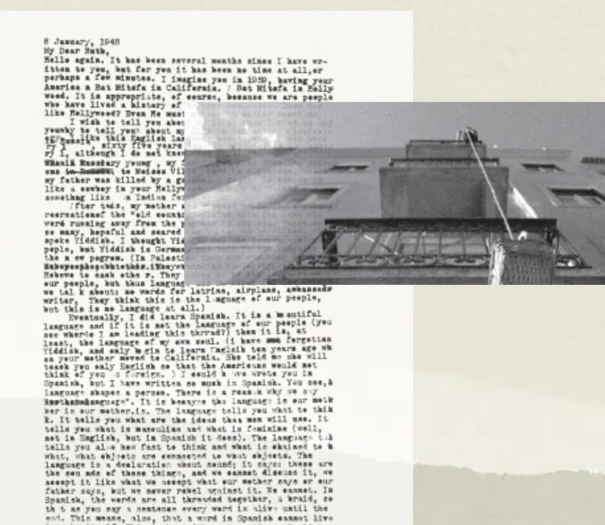
In the end, the designers developed a visual identity using the reminiscent of letterpress and collage work, with occasional handwriting flourishes and footnotes and bookish Tables of Contents.
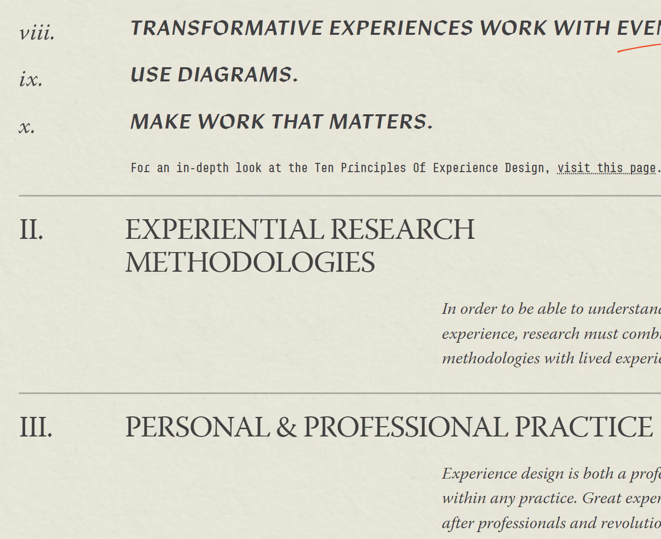
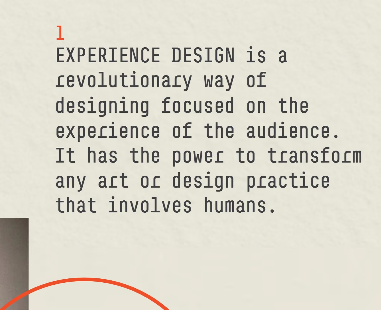
Looking through moodboards and proposals made clear how every font choice, every image treatment, every menu option told a story, and evoked the materiality of books. This act of translation, from the narrative to the aesthetic, is the superpower of the graphic designer. There are even some easter eggs here and there. It was a process with lots of back and forth, but one that ultimately deepened our own understanding of who we are and what we offer.
